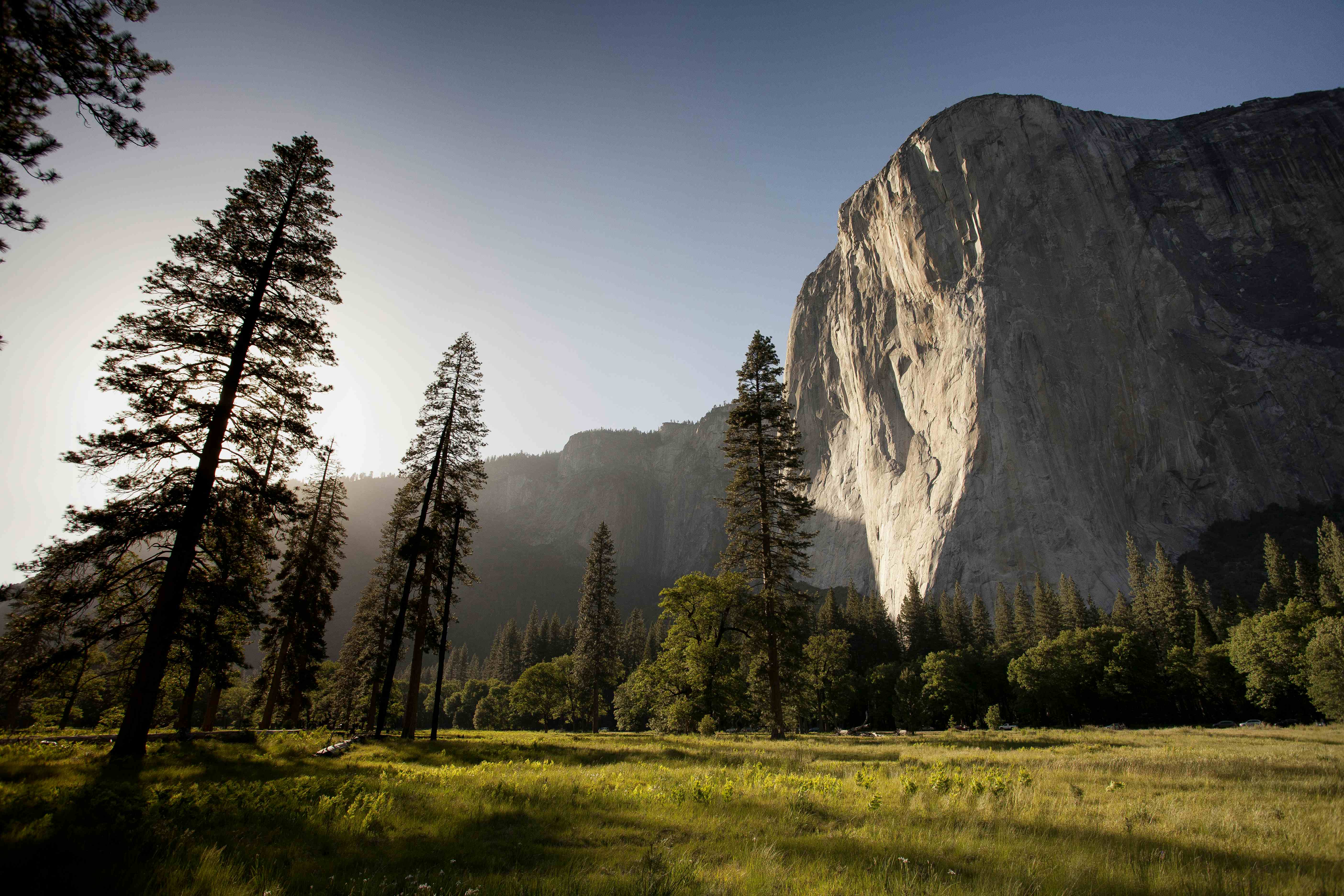
Carousels display a series of content slides along a horizontal or vertical axis, one or more at a time.
Users can navigate between slides with controls, pagination, or autoplay.
<wa-carouselpaginationnavigationmouse-draggingloop><wa-carousel-item><imgalt="The sun shines on the mountains and trees (by Adam Kool on Unsplash)"src="https://images.unsplash.com/photo-1426604966848-d7adac402bff?q=10"/></wa-carousel-item><wa-carousel-item><imgalt="A river winding through an evergreen forest (by Luca Bravo on Unsplash)"src="https://images.unsplash.com/photo-1473448912268-2022ce9509d8?q=10"/></wa-carousel-item><wa-carousel-item><imgalt="The sun is setting over a lavender field (by Leonard Cotte on Unsplash)"src="https://images.unsplash.com/photo-1499002238440-d264edd596ec?q=10"/></wa-carousel-item><wa-carousel-item><imgalt="A field of grass with the sun setting in the background (by Sapan Patel on Unsplash)"src="https://images.unsplash.com/photo-1475113548554-5a36f1f523d6?q=10"/></wa-carousel-item><wa-carousel-item><imgalt="A scenic view of a mountain with clouds rolling in (by V2osk on Unsplash)"src="https://images.unsplash.com/photo-1470071459604-3b5ec3a7fe05?q=10"/></wa-carousel-item></wa-carousel>
Examples
Link to This Section
Pagination
Link to This Section
Use the pagination attribute to show the total number of slides and the current slide as a set of interactive dots.
<wa-carouselpagination><wa-carousel-item><imgalt="The sun shines on the mountains and trees (by Adam Kool on Unsplash)"src="https://images.unsplash.com/photo-1426604966848-d7adac402bff?q=10"/></wa-carousel-item><wa-carousel-item><imgalt="A river winding through an evergreen forest (by Luca Bravo on Unsplash)"src="https://images.unsplash.com/photo-1473448912268-2022ce9509d8?q=10"/></wa-carousel-item><wa-carousel-item><imgalt="The sun is setting over a lavender field (by Leonard Cotte on Unsplash)"src="https://images.unsplash.com/photo-1499002238440-d264edd596ec?q=10"/></wa-carousel-item><wa-carousel-item><imgalt="A field of grass with the sun setting in the background (by Sapan Patel on Unsplash)"src="https://images.unsplash.com/photo-1475113548554-5a36f1f523d6?q=10"/></wa-carousel-item><wa-carousel-item><imgalt="A scenic view of a mountain with clouds rolling in (by V2osk on Unsplash)"src="https://images.unsplash.com/photo-1470071459604-3b5ec3a7fe05?q=10"/></wa-carousel-item></wa-carousel>
Navigation
Link to This Section
Use the navigation attribute to show previous and next buttons.
<wa-carouselnavigation><wa-carousel-item><imgalt="The sun shines on the mountains and trees (by Adam Kool on Unsplash)"src="https://images.unsplash.com/photo-1426604966848-d7adac402bff?q=10"/></wa-carousel-item><wa-carousel-item><imgalt="A river winding through an evergreen forest (by Luca Bravo on Unsplash)"src="https://images.unsplash.com/photo-1473448912268-2022ce9509d8?q=10"/></wa-carousel-item><wa-carousel-item><imgalt="The sun is setting over a lavender field (by Leonard Cotte on Unsplash)"src="https://images.unsplash.com/photo-1499002238440-d264edd596ec?q=10"/></wa-carousel-item><wa-carousel-item><imgalt="A field of grass with the sun setting in the background (by Sapan Patel on Unsplash)"src="https://images.unsplash.com/photo-1475113548554-5a36f1f523d6?q=10"/></wa-carousel-item><wa-carousel-item><imgalt="A scenic view of a mountain with clouds rolling in (by V2osk on Unsplash)"src="https://images.unsplash.com/photo-1470071459604-3b5ec3a7fe05?q=10"/></wa-carousel-item></wa-carousel>
Loop
Link to This Section
By default, the carousel will not advance beyond the first and last slides. You can change this behavior and force the carousel to "wrap" with the loop attribute.
<wa-carouselloopnavigationpagination><wa-carousel-item><imgalt="The sun shines on the mountains and trees (by Adam Kool on Unsplash)"src="https://images.unsplash.com/photo-1426604966848-d7adac402bff?q=10"/></wa-carousel-item><wa-carousel-item><imgalt="A river winding through an evergreen forest (by Luca Bravo on Unsplash)"src="https://images.unsplash.com/photo-1473448912268-2022ce9509d8?q=10"/></wa-carousel-item><wa-carousel-item><imgalt="The sun is setting over a lavender field (by Leonard Cotte on Unsplash)"src="https://images.unsplash.com/photo-1499002238440-d264edd596ec?q=10"/></wa-carousel-item><wa-carousel-item><imgalt="A field of grass with the sun setting in the background (by Sapan Patel on Unsplash)"src="https://images.unsplash.com/photo-1475113548554-5a36f1f523d6?q=10"/></wa-carousel-item><wa-carousel-item><imgalt="A scenic view of a mountain with clouds rolling in (by V2osk on Unsplash)"src="https://images.unsplash.com/photo-1470071459604-3b5ec3a7fe05?q=10"/></wa-carousel-item></wa-carousel>
Autoplay
Link to This Section
The carousel will automatically advance when the autoplay attribute is used. To change how long a slide is shown before advancing, set autoplay-interval to the desired number of milliseconds. For best results, use the loop attribute when autoplay is enabled. Autoplay pauses while the user interacts with the carousel.
<wa-carouselautoplaylooppagination><wa-carousel-item><imgalt="The sun shines on the mountains and trees (by Adam Kool on Unsplash)"src="https://images.unsplash.com/photo-1426604966848-d7adac402bff?q=10"/></wa-carousel-item><wa-carousel-item><imgalt="A river winding through an evergreen forest (by Luca Bravo on Unsplash)"src="https://images.unsplash.com/photo-1473448912268-2022ce9509d8?q=10"/></wa-carousel-item><wa-carousel-item><imgalt="The sun is setting over a lavender field (by Leonard Cotte on Unsplash)"src="https://images.unsplash.com/photo-1499002238440-d264edd596ec?q=10"/></wa-carousel-item><wa-carousel-item><imgalt="A field of grass with the sun setting in the background (by Sapan Patel on Unsplash)"src="https://images.unsplash.com/photo-1475113548554-5a36f1f523d6?q=10"/></wa-carousel-item><wa-carousel-item><imgalt="A scenic view of a mountain with clouds rolling in (by V2osk on Unsplash)"src="https://images.unsplash.com/photo-1470071459604-3b5ec3a7fe05?q=10"/></wa-carousel-item></wa-carousel>
Orientation
Link to This Section
Setting the orientation attribute to vertical will render the carousel in a vertical layout. If the content of your slides vary in height, you will need to set an explicit height or max-height on the carousel using CSS.
<wa-carouselclass="vertical"paginationorientation="vertical"><wa-carousel-item><imgalt="The sun shines on the mountains and trees (by Adam Kool on Unsplash)"src="https://images.unsplash.com/photo-1426604966848-d7adac402bff?q=10"/></wa-carousel-item><wa-carousel-item><imgalt="A river winding through an evergreen forest (by Luca Bravo on Unsplash)"src="https://images.unsplash.com/photo-1473448912268-2022ce9509d8?q=10"/></wa-carousel-item><wa-carousel-item><imgalt="The sun is setting over a lavender field (by Leonard Cotte on Unsplash)"src="https://images.unsplash.com/photo-1499002238440-d264edd596ec?q=10"/></wa-carousel-item><wa-carousel-item><imgalt="A field of grass with the sun setting in the background (by Sapan Patel on Unsplash)"src="https://images.unsplash.com/photo-1475113548554-5a36f1f523d6?q=10"/></wa-carousel-item><wa-carousel-item><imgalt="A scenic view of a mountain with clouds rolling in (by V2osk on Unsplash)"src="https://images.unsplash.com/photo-1470071459604-3b5ec3a7fe05?q=10"/></wa-carousel-item></wa-carousel><style>.vertical{max-height: 400px;}.vertical::part(carousel){grid-template-areas:'slides slides pagination';}.vertical::part(pagination){flex-direction: column;}.vertical::part(navigation){transform:rotate(90deg);display: flex;}</style>
Aspect Ratio
Link to This Section
Use the --aspect-ratio custom property to customize the size of the carousel's viewport from the default value of 16/9.
1/13/216/9
<div><wa-carouselclass="aspect-ratio"navigationpaginationstyle="--aspect-ratio: 3/2;"><wa-carousel-item><imgalt="The sun shines on the mountains and trees (by Adam Kool on Unsplash)"src="https://images.unsplash.com/photo-1426604966848-d7adac402bff?q=10"/></wa-carousel-item><wa-carousel-item><imgalt="A river winding through an evergreen forest (by Luca Bravo on Unsplash)"src="https://images.unsplash.com/photo-1473448912268-2022ce9509d8?q=10"/></wa-carousel-item><wa-carousel-item><imgalt="The sun is setting over a lavender field (by Leonard Cotte on Unsplash)"src="https://images.unsplash.com/photo-1499002238440-d264edd596ec?q=10"/></wa-carousel-item><wa-carousel-item><imgalt="A field of grass with the sun setting in the background (by Sapan Patel on Unsplash)"src="https://images.unsplash.com/photo-1475113548554-5a36f1f523d6?q=10"/></wa-carousel-item><wa-carousel-item><imgalt="A scenic view of a mountain with clouds rolling in (by V2osk on Unsplash)"src="https://images.unsplash.com/photo-1470071459604-3b5ec3a7fe05?q=10"/></wa-carousel-item></wa-carousel><wa-divider></wa-divider><divclass="wa-cluster"><wa-selectlabel="Aspect ratio"name="aspect"value="3/2"><wa-optionvalue="1/1">1/1</wa-option><wa-optionvalue="3/2">3/2</wa-option><wa-optionvalue="16/9">16/9</wa-option></wa-select></div></div><script>(()=>{const carousel = document.querySelector('wa-carousel.aspect-ratio');const aspectRatio = document.querySelector('wa-select[name="aspect"]');
aspectRatio.addEventListener('change',()=>{
carousel.style.setProperty('--aspect-ratio', aspectRatio.value);});})();</script>
Multiple Slides per View
Link to This Section
The slides-per-page attribute makes it possible to display multiple slides at a time. You can also use the slides-per-move attribute to advance more than one slide at a time, if desired.
Use the --scroll-hint custom property to add inline padding in horizontal carousels and block padding in vertical carousels. This will make the closest slides slightly visible, hinting that there are more items in the carousel.
<wa-carouselclass="scroll-hint"paginationstyle="--scroll-hint: 10%;"><wa-carousel-item><imgalt="The sun shines on the mountains and trees (by Adam Kool on Unsplash)"src="https://images.unsplash.com/photo-1426604966848-d7adac402bff?q=10"/></wa-carousel-item><wa-carousel-item><imgalt="A river winding through an evergreen forest (by Luca Bravo on Unsplash)"src="https://images.unsplash.com/photo-1473448912268-2022ce9509d8?q=10"/></wa-carousel-item><wa-carousel-item><imgalt="The sun is setting over a lavender field (by Leonard Cotte on Unsplash)"src="https://images.unsplash.com/photo-1499002238440-d264edd596ec?q=10"/></wa-carousel-item><wa-carousel-item><imgalt="A field of grass with the sun setting in the background (by Sapan Patel on Unsplash)"src="https://images.unsplash.com/photo-1475113548554-5a36f1f523d6?q=10"/></wa-carousel-item><wa-carousel-item><imgalt="A scenic view of a mountain with clouds rolling in (by V2osk on Unsplash)"src="https://images.unsplash.com/photo-1470071459604-3b5ec3a7fe05?q=10"/></wa-carousel-item></wa-carousel>
Mouse Dragging
Link to This Section
The carousel uses scroll snap to position slides at various snap positions. This allows users to scroll through the slides very naturally, especially on touch devices. Unfortunately, desktop users won't be able to click and drag with a mouse, which can feel unnatural. Adding the mouse-dragging attribute can help with this.
This example is best demonstrated using a mouse. Try clicking and dragging the slide to move it. Then toggle the switch and try again.
Enable mouse dragging
<divclass="mouse-dragging"><wa-carouselpagination><wa-carousel-item><imgalt="The sun shines on the mountains and trees (by Adam Kool on Unsplash)"src="https://images.unsplash.com/photo-1426604966848-d7adac402bff?q=10"/></wa-carousel-item><wa-carousel-item><imgalt="A river winding through an evergreen forest (by Luca Bravo on Unsplash)"src="https://images.unsplash.com/photo-1473448912268-2022ce9509d8?q=10"/></wa-carousel-item><wa-carousel-item><imgalt="The sun is setting over a lavender field (by Leonard Cotte on Unsplash)"src="https://images.unsplash.com/photo-1499002238440-d264edd596ec?q=10"/></wa-carousel-item><wa-carousel-item><imgalt="A field of grass with the sun setting in the background (by Sapan Patel on Unsplash)"src="https://images.unsplash.com/photo-1475113548554-5a36f1f523d6?q=10"/></wa-carousel-item><wa-carousel-item><imgalt="A scenic view of a mountain with clouds rolling in (by V2osk on Unsplash)"src="https://images.unsplash.com/photo-1470071459604-3b5ec3a7fe05?q=10"/></wa-carousel-item></wa-carousel><wa-divider></wa-divider><wa-switch>Enable mouse dragging</wa-switch></div><script>const container = document.querySelector('.mouse-dragging');const carousel = container.querySelector('wa-carousel');const toggle = container.querySelector('wa-switch');
toggle.addEventListener('change',()=>{
carousel.toggleAttribute('mouse-dragging', toggle.checked);});</script>
Adding & Removing Slides
Link to This Section
The content of the carousel can be changed by adding or removing carousel items. The carousel will update itself automatically.
The carousel's API makes it possible to extend and customize. This example syncs the active slide with a set of thumbnails, effectively creating a gallery-style carousel.
<wa-carouselclass="carousel-thumbnails"navigationloop><wa-carousel-item><imgalt="The sun shines on the mountains and trees (by Adam Kool on Unsplash)"src="https://images.unsplash.com/photo-1426604966848-d7adac402bff?q=10"/></wa-carousel-item><wa-carousel-item><imgalt="A river winding through an evergreen forest (by Luca Bravo on Unsplash)"src="https://images.unsplash.com/photo-1473448912268-2022ce9509d8?q=10"/></wa-carousel-item><wa-carousel-item><imgalt="The sun is setting over a lavender field (by Leonard Cotte on Unsplash)"src="https://images.unsplash.com/photo-1499002238440-d264edd596ec?q=10"/></wa-carousel-item><wa-carousel-item><imgalt="A field of grass with the sun setting in the background (by Sapan Patel on Unsplash)"src="https://images.unsplash.com/photo-1475113548554-5a36f1f523d6?q=10"/></wa-carousel-item><wa-carousel-item><imgalt="A scenic view of a mountain with clouds rolling in (by V2osk on Unsplash)"src="https://images.unsplash.com/photo-1470071459604-3b5ec3a7fe05?q=10"/></wa-carousel-item></wa-carousel><divclass="thumbnails"><divclass="scroller"><imgalt="Thumbnail by 1"class="image active"src="https://images.unsplash.com/photo-1426604966848-d7adac402bff?q=10"/><imgalt="Thumbnail by 2"class="image"src="https://images.unsplash.com/photo-1473448912268-2022ce9509d8?q=10"/><imgalt="Thumbnail by 3"class="image"src="https://images.unsplash.com/photo-1499002238440-d264edd596ec?q=10"/><imgalt="Thumbnail by 4"class="image"src="https://images.unsplash.com/photo-1475113548554-5a36f1f523d6?q=10"/><imgalt="Thumbnail by 5"class="image"src="https://images.unsplash.com/photo-1470071459604-3b5ec3a7fe05?q=10"/></div></div><style>.carousel-thumbnails{--slide-aspect-ratio: 3 / 2;}.thumbnails{display: flex;justify-content: center;}.scroller{display: flex;gap:var(--wa-space-s);overflow-x: auto;scrollbar-width: none;scroll-behavior: smooth;scroll-padding:var(--wa-space-s);}.scroller::-webkit-scrollbar{display: none;}.image{width: 64px;height: 64px;object-fit: cover;opacity: 0.3;will-change: opacity;transition: 250ms opacity;cursor: pointer;}.image.active{opacity: 1;}</style><script>{const carousel = document.querySelector('.carousel-thumbnails');const scroller = document.querySelector('.scroller');const thumbnails = document.querySelectorAll('.image');
scroller.addEventListener('click',e=>{const target = e.target;if(target.matches('.image')){const index =[...thumbnails].indexOf(target);
carousel.goToSlide(index);}});
carousel.addEventListener('wa-slide-change',e=>{const slideIndex = e.detail.index;[...thumbnails].forEach((thumb, i)=>{
thumb.classList.toggle('active', i === slideIndex);if(i === slideIndex){
thumb.scrollIntoView({block:'nearest',});}});});}</script>
API
Link to This Section
Importing
Link to This Section
If you're using the autoloader or a hosted project, components load on demand — no manual import needed. To
cherry-pick a component manually, use one of the following snippets.
When set, the slides will scroll automatically when the user is not interacting with them.
Typeboolean
Defaultfalse
autoplayInterval
autoplay-interval
Specifies the amount of time, in milliseconds, between each automatic scroll.
Typenumber
Default3000
loop
loop
When set, allows the user to navigate the carousel in the same direction indefinitely.
Typeboolean
Defaultfalse
mouseDragging
mouse-dragging
When set, it is possible to scroll through the slides by dragging them with the mouse.
Typeboolean
Defaultfalse
navigation
navigation
When set, show the carousel's navigation.
Typeboolean
Defaultfalse
orientation
orientation
Specifies the orientation in which the carousel will lay out.
Type'horizontal' | 'vertical'
Default'horizontal'
pagination
pagination
When set, show the carousel's pagination indicators.
Typeboolean
Defaultfalse
slidesPerMove
slides-per-move
Specifies the number of slides the carousel will advance when scrolling, useful when specifying a slides-per-page
greater than one. It can't be higher than slides-per-page.
Typenumber
Default1
slidesPerPage
slides-per-page
Specifies how many slides should be shown at a given time.